Radial Menu Spell

The RadialMenuSpell component creates a beautiful circular menu that appears at the cursor position, perfect for providing quick contextual actions. It features smooth animations, visual feedback, and supports both keyboard and mouse activation. Radial Menu Demo
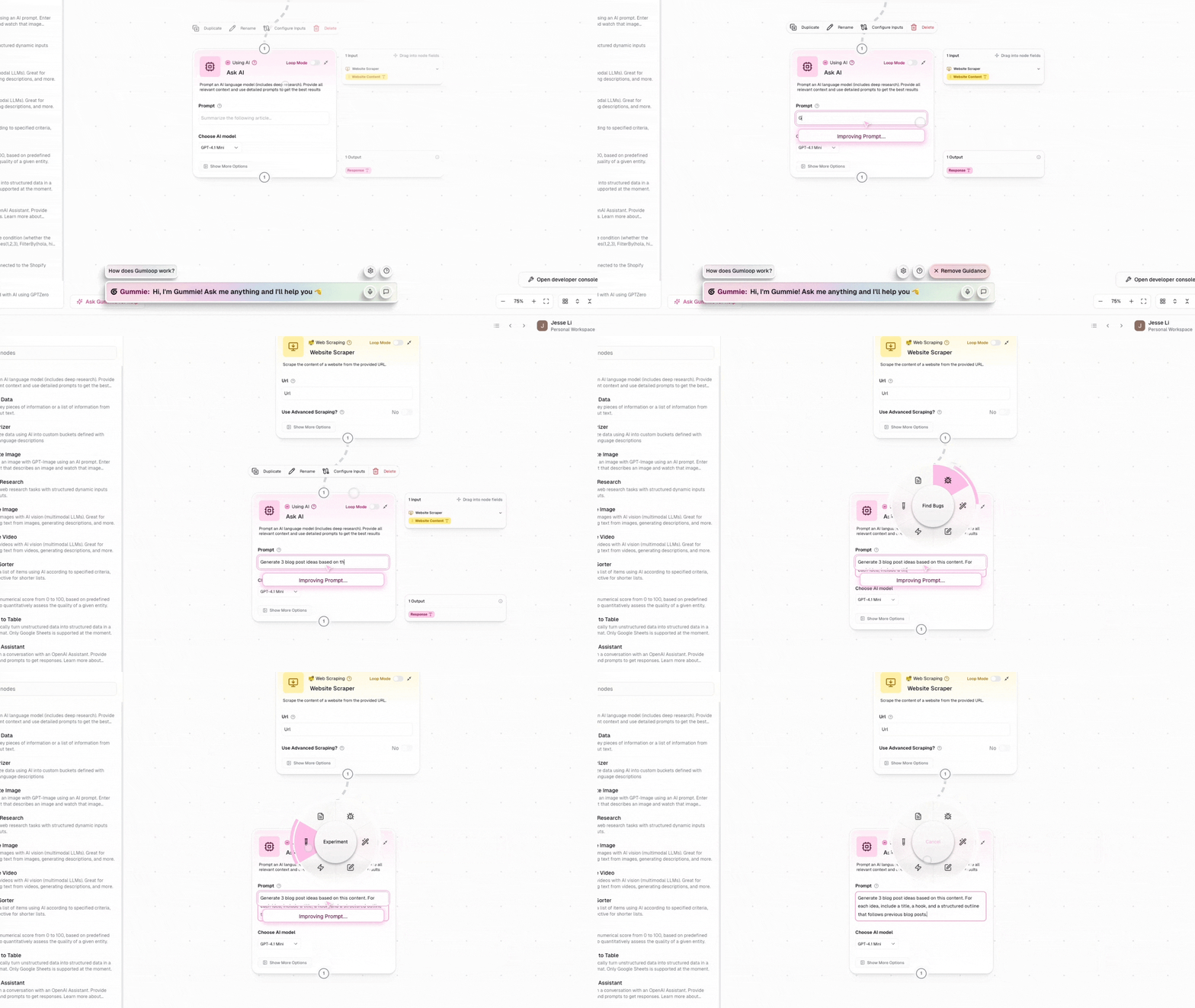
Features

  • Circular Layout: Items arranged in a circle for equal access
  • Visual Feedback: Animated hover states and selection indicators
  • Cancel Zone: Center area for canceling without action
  • Flexible Activation: Supports keyboard shortcuts and mouse events
  • Hold-to-Select: Natural interaction pattern for quick actions
  • Escape Support: Press ESC to cancel without executing
  • Theme Integration: Adapts to Cedar’s light/dark mode
  • Icon Support: Use emojis or Lucide icons for menu items

Installation

import { RadialMenuSpell } from 'cedar-os-components/spells';

Basic Usage

import {
	RadialMenuSpell,
	type RadialMenuItem,
} from 'cedar-os-components/spells';
import { MouseEvent, ActivationMode } from 'cedar-os';
import { Copy, Trash, Edit, Share } from 'lucide-react';

function MyComponent() {
	const menuItems: RadialMenuItem[] = [
		{
			title: 'Copy',
			icon: Copy,
			onInvoke: (store) => {
				// Access Cedar store for actions
				console.log('Copy action');
			},
		},
		{
			title: 'Edit',
			icon: Edit,
			onInvoke: (store) => {
				console.log('Edit action');
			},
		},
		{
			title: 'Share',
			icon: Share,
			onInvoke: (store) => {
				console.log('Share action');
			},
		},
		{
			title: 'Delete',
			icon: Trash,
			onInvoke: (store) => {
				console.log('Delete action');
			},
		},
	];

	return (
		<RadialMenuSpell
			spellId='my-radial-menu'
			items={menuItems}
			activationConditions={{
				events: [MouseEvent.RIGHT_CLICK],
				mode: ActivationMode.HOLD,
			}}
		/>
	);
}

Props

RadialMenuSpell Props

PropTypeRequiredDescription
spellIdstringYesUnique identifier for this spell instance
itemsRadialMenuItem[]YesArray of menu items to display
activationConditionsActivationConditionsYesConditions that trigger the menu

RadialMenuItem Interface

interface RadialMenuItem {
	/** Display title (shown in center on hover) */
	title: string;

	/** Emoji string or Lucide icon component */
	icon: string | LucideIcon;

	/** Callback when item is selected */
	onInvoke: (store: CedarStore) => void;
}

Activation Patterns

The most natural interaction for radial menus is the hold pattern:
activationConditions={{
  events: [MouseEvent.RIGHT_CLICK],
  mode: ActivationMode.HOLD
}}
User flow:
  1. Right-click and hold to open menu
  2. Move mouse to desired item (it highlights)
  3. Release to execute action
  4. Or move to center and release to cancel

Toggle Pattern

For persistent menus that stay open:
activationConditions={{
  events: [Hotkey.SPACE],
  mode: ActivationMode.TOGGLE
}}
User flow:
  1. Press Space to open menu
  2. Move mouse to select item
  3. Click to execute or press Space again to close

Keyboard Shortcut

Bind to any keyboard shortcut:
activationConditions={{
  events: ['ctrl+e', 'cmd+e'],
  mode: ActivationMode.HOLD
}}

Advanced Examples

AI Actions Menu

Create an AI-powered context menu:
import { Sparkles, Brain, Wand2, Zap } from 'lucide-react';

const aiMenuItems: RadialMenuItem[] = [
	{
		title: 'Explain',
		icon: Brain,
		onInvoke: async (store) => {
			const selection = window.getSelection()?.toString();
			if (selection) {
				await store.sendMessage({
					content: `Explain this: ${selection}`,
					role: 'user',
				});
			}
		},
	},
	{
		title: 'Improve',
		icon: Sparkles,
		onInvoke: async (store) => {
			const selection = window.getSelection()?.toString();
			if (selection) {
				await store.sendMessage({
					content: `Improve this text: ${selection}`,
					role: 'user',
				});
			}
		},
	},
	{
		title: 'Summarize',
		icon: Zap,
		onInvoke: async (store) => {
			await store.sendMessage({
				content: 'Summarize the current conversation',
				role: 'user',
			});
		},
	},
	{
		title: 'Generate',
		icon: Wand2,
		onInvoke: (store) => {
			// Open generation dialog
			store.setSpellActive('generation-dialog', true);
		},
	},
];

Emoji-Based Menu

Use emojis for a playful interface:
const emojiMenuItems: RadialMenuItem[] = [
	{
		title: 'Love it!',
		icon: '❤️',
		onInvoke: (store) => {
			// Add reaction
		},
	},
	{
		title: 'Celebrate',
		icon: '🎉',
		onInvoke: (store) => {
			// Trigger celebration
		},
	},
	{
		title: 'Question',
		icon: '❓',
		onInvoke: (store) => {
			// Ask for clarification
		},
	},
	{
		title: 'Bookmark',
		icon: '📌',
		onInvoke: (store) => {
			// Save for later
		},
	},
];

Dynamic Menu Items

Generate menu items based on context:
function ContextualRadialMenu({ selectedElement }) {
	const menuItems = useMemo(() => {
		const items: RadialMenuItem[] = [];

		if (selectedElement?.type === 'image') {
			items.push({
				title: 'Download',
				icon: Download,
				onInvoke: () => downloadImage(selectedElement),
			});
			items.push({
				title: 'Edit',
				icon: Edit,
				onInvoke: () => openImageEditor(selectedElement),
			});
		}

		if (selectedElement?.type === 'text') {
			items.push({
				title: 'Copy',
				icon: Copy,
				onInvoke: () => copyToClipboard(selectedElement.content),
			});
		}

		// Add common items
		items.push({
			title: 'Share',
			icon: Share,
			onInvoke: () => shareContent(selectedElement),
		});

		return items;
	}, [selectedElement]);

	return (
		<RadialMenuSpell
			spellId='contextual-menu'
			items={menuItems}
			activationConditions={{
				events: [MouseEvent.RIGHT_CLICK],
				mode: ActivationMode.HOLD,
			}}
		/>
	);
}

Visual Customization

The radial menu automatically adapts to Cedar’s styling system:

Theme Integration

The component uses Cedar’s styling context:
  • Brand Color: Used for hover states and selection
  • Dark Mode: Automatically adjusts colors and contrasts
  • Text Colors: Adapts based on theme

Layout Constants

The component uses these layout constants (defined in the component):
const MENU_RADIUS = 100; // Radius of the menu circle
const INNER_RADIUS = 50; // Cancel zone radius
const INNER_GAP = 4; // Gap between zones
const OUTER_PADDING = 10; // Outer padding
const BORDER_STROKE_WIDTH = 8; // Ring thickness

Interaction Details

Mouse Behavior

  • Hover: Moving mouse over items highlights them
  • Center Zone: Moving to center shows “Cancel”
  • Selection: Release (hold mode) or click (toggle mode) to select
  • Visual Feedback: Animated ring shows current selection

Keyboard Support

  • ESC: Cancel without executing any action
  • Activation Keys: Defined by activationConditions

Position Handling

  • Mouse Events: Menu appears at cursor position
  • Keyboard Events: Menu appears at viewport center
  • Smart Positioning: Stays within viewport bounds

Best Practices

1. Limit Item Count

Keep menus focused with 3-8 items:
// ✅ Good: Focused set of actions
const items = [
	{ title: 'Edit', icon: Edit, onInvoke: handleEdit },
	{ title: 'Share', icon: Share, onInvoke: handleShare },
	{ title: 'Delete', icon: Trash, onInvoke: handleDelete },
];

// ❌ Avoid: Too many items
const items = [
	/* 12+ items */
]; // Hard to navigate quickly

2. Use Clear Icons

Choose recognizable icons:
// ✅ Good: Clear, standard icons
{
	icon: Copy;
} // Universal copy icon
{
	icon: '📋';
} // Clear emoji

// ❌ Avoid: Ambiguous icons
{
	icon: Circle;
} // What does this do?
{
	icon: '🔮';
} // Unclear meaning

3. Consistent Actions

Keep onInvoke callbacks focused:
// ✅ Good: Single responsibility
onInvoke: (store) => {
	const data = prepareData();
	store.sendMessage({ content: data, role: 'user' });
};

// ❌ Avoid: Multiple unrelated actions
onInvoke: (store) => {
	updateUI();
	saveToDatabase();
	sendAnalytics();
	showNotification();
};

4. Handle Errors Gracefully

onInvoke: async (store) => {
	try {
		await performAction();
	} catch (error) {
		store.addMessage({
			content: 'Action failed. Please try again.',
			role: 'system',
		});
	}
};

Accessibility Considerations

While the radial menu is primarily a visual component, consider these accessibility aspects:
  1. Alternative Activation: Provide keyboard shortcuts as alternatives
  2. Clear Labels: Use descriptive titles for screen readers
  3. Escape Route: Always allow ESC key to cancel
  4. Visual Contrast: The component respects Cedar’s theme for proper contrast

Performance Notes

  • Singleton Management: Uses Cedar’s spell system for efficient event handling
  • Animation Performance: Uses CSS transforms for smooth animations
  • Memory Efficient: Automatically cleaned up when component unmounts
  • Event Delegation: Single set of listeners for all instances

Common Patterns

Tool Selection Menu

const tools = [
	{ title: 'Select', icon: MousePointer },
	{ title: 'Draw', icon: Pencil },
	{ title: 'Erase', icon: Eraser },
	{ title: 'Text', icon: Type },
];
const navigation = [
	{ title: 'Home', icon: Home },
	{ title: 'Search', icon: Search },
	{ title: 'Settings', icon: Settings },
	{ title: 'Profile', icon: User },
];

Media Controls

const mediaControls = [
	{ title: 'Play', icon: Play },
	{ title: 'Pause', icon: Pause },
	{ title: 'Next', icon: SkipForward },
	{ title: 'Previous', icon: SkipBack },
];

Troubleshooting

  • Check that the spell ID is unique
  • Verify activation conditions are correct
  • Ensure component is mounted

Items not executing

  • Verify onInvoke callbacks are defined
  • Check for errors in callback functions
  • Ensure Cedar store is accessible

Visual issues

  • Component adapts to Cedar’s theme automatically
  • Check that Cedar styling context is provided
  • Verify Container3D component is available